Figure 1

Overview
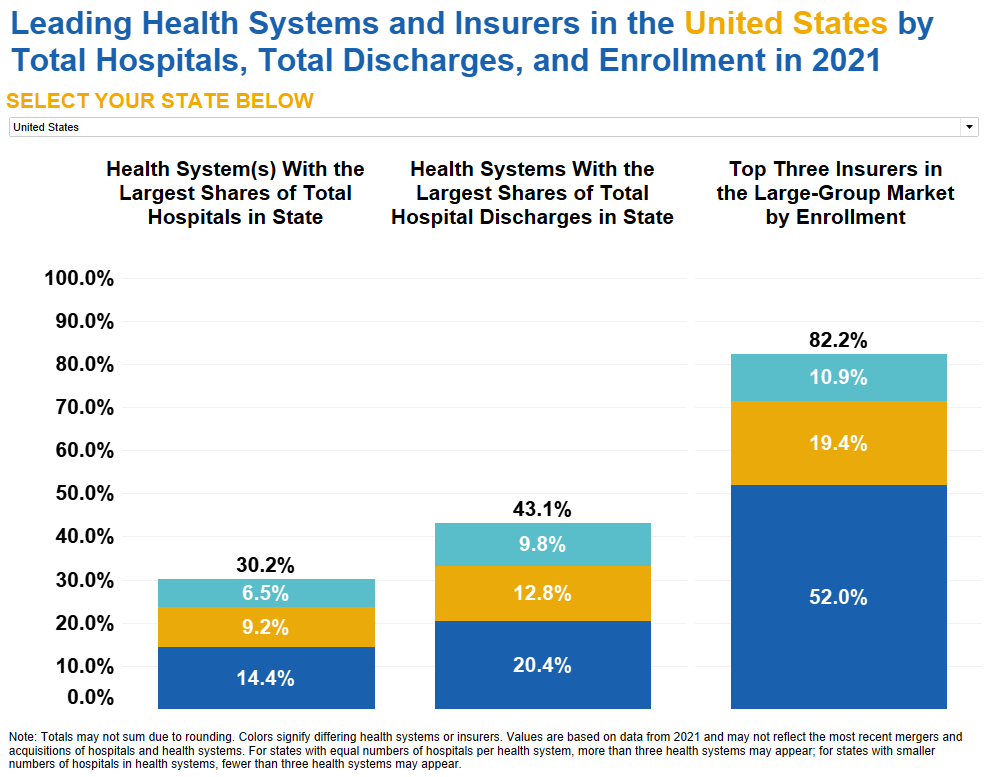
The figure contains a stacked bar chart that shows the average market share percentages of the leading health systems and insurers in the United States by total hospitals, total inpatient hospital discharges, and total large-group insurance enrollment in 2021. It shows that across all states, the top three insurers in the large-group market have a larger market share by enrollment compared to the largest health systems by both total number of hospitals and total number of inpatient discharges. Health systems with the largest shares of total hospitals and total hospital discharges in a state have similar total averages, while the top three insurers in the large-group market by enrollment have a significantly higher total average.
Values
| Health System(s) With the Largest Shares of Total Hospitals in State | Health Systems With the Largest Shares of Total Hospital Discharges in State | Top Three Insurers in the Large-Group Market by Enrollment | |
|---|---|---|---|
| Total | 30.2% | 43.1% | 82.2% |
| Largest | 14.4% | 20.4% | 52.0% |
| Second-Largest | 9.2% | 12.8% | 19.4% |
| Third-Largest | 6.5% | 9.8% | 10.9% |
Presentation
The stacked bar chart represents the market share percentages of the top three largest health systems by total hospitals and total inpatient hospital discharges and insurers in the large-group market in the U.S. The x-axis represents the three market share categories: Health Systems(s) With the Largest Shares of Total Hospitals in State, Health Systems With the Largest Shares of Total Hospital Discharges in State, and Top Three Insurers in the Large-Group Market by Enrollment. The y-axis represents the percentage of market share, ranging from 0% to 100%. The total average of the largest hospitals and insurers is represented at the top of each stacked bar. The three largest hospitals and insurers are represented in each of the three stacked bars by color from bottom to top: Largest (dark blue), Second-Largest (gold), and Third-Largest (teal).
Figure 2

Overview
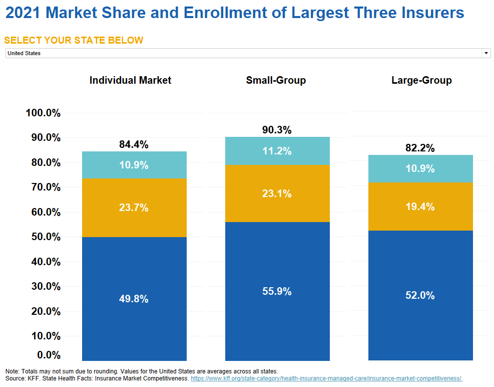
The figure contains a stacked bar chart that shows the market share percentages of the largest three insurers by total enrollment and insurance type in the United States in 2021. It shows that across all states, the top 3 insurers in the individual, small, and large-group markets all have a majority of the market share.
Values
| Individual Market | Small-Group | Large-Group | |
|---|---|---|---|
| Total | 84.4% | 90.3% | 82.2% |
| Largest | 49.8% | 55.9% | 52.0% |
| Second-Largest | 23.7% | 23.1% | 19.4% |
| Third-Largest | 10.9% | 11.2% | 10.9% |
Presentation
The stacked bar chart represents the market share percentages of the top three insurers by total enrollment and individual, small-group, and large-group market across in the U.S. The x-axis represents the insurer market type from left to right: Individual Market, Small-Group, and Large-Group. The y-axis represents the percentage of market share, ranging from 0% to 100%. The total average of the largest insurers is represented at the top of each stacked bar. The three largest insurers are represented in each of the three stacked bars by color from bottom to top: Largest (dark blue), Second-Largest (gold), Third-Largest (teal).
