Figure 1
Overview
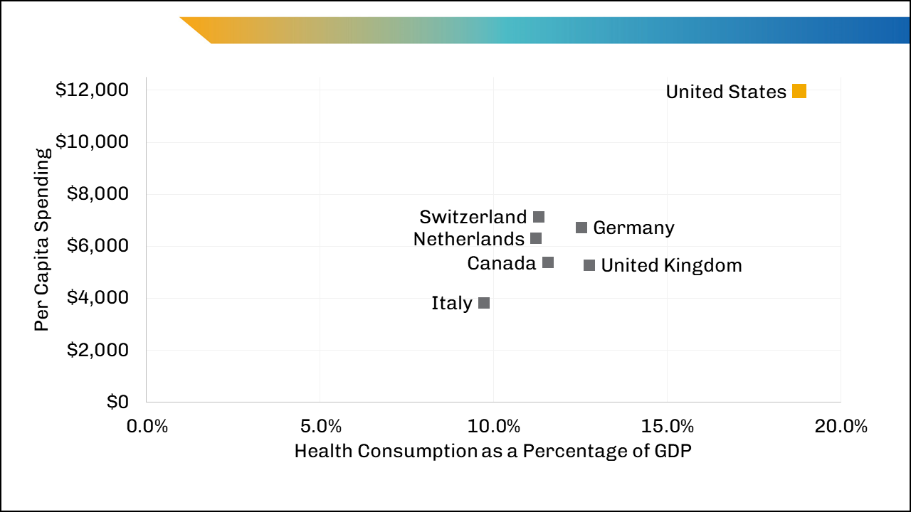
The figure shows health consumption spending per capita and as a percentage of gross domestic product (GDP) in 2020. It shows that the countries of Switzerland, Netherlands, Germany, Canada, United Kingdom, and Italy, have similar health consumption spending as a percentage of GDP, with Italy spending the lowest on health care as a percentage of GPD, and the United Kingdom spending the highest on health care as a percentage of GDP. In contrast, the United States has a higher health consumption spending percentage of GDP than any other country.
Values
| Italy | Netherlands | Switzerland | Canada | Germany | United Kingdom | United States | |
|---|---|---|---|---|---|---|---|
| Per Capita Spending | $3,819 | $6,299 | $7,138 | $5,370 | $6,731 | $5,268 | $11,945 |
| Health Consumption as Percentage of GDP | 9.7% | 11.2% | 11.3% | 11.6% | 12.5% | 12.8% | 18.8% |
Presentation
This scatter plot represents health consumption spending per capita and as a percentage of GDP, the range of per capita spending, and the range of health consumption as a percentage of GDP for 7 countries. The vertical access represents health consumption spending per capita, ranging from $0 to $12,000, and the horizontal axis represents health consumption as a percentage of GDP ranging from 0% to 20%. Boxes within the scatterplot present each country’s health consumption spending per capita and the health consumption as a percentage of GDP. The boxes for Italy, Netherlands, Switzerland, Canada, Germany, and United Kingdom are gray, and the box for the United States is gold.
Figure 2
Overview
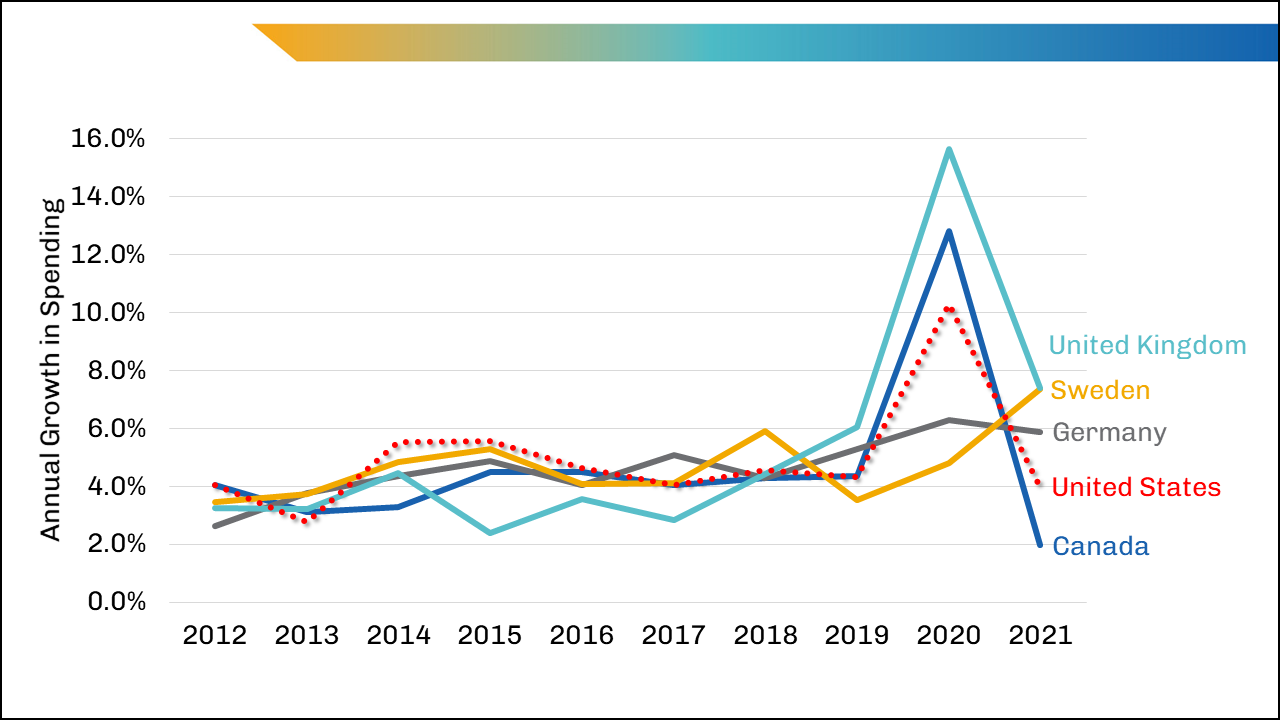
The figure shows annual percentage growth in health care spending by country from 2012 to 2021. It shows that the United States has a similar growth in spending from year to year compared to the United Kingdom, Sweden, Germany, and Canada. All 5 countries have an increase in annual growth in spending in the year 2020. The United Kingdom has the highest annual growth of spending in 2020, followed by Canada, the United States, Germany, and the lowest amount of annual growth of spending is from Sweden.
Values
| Country | 2012 | 2013 | 2014 | 2015 | 2016 | 2017 | 2018 | 2019 | 2020 | 2021 |
|---|---|---|---|---|---|---|---|---|---|---|
| Canada | 4.1% | 3.1% | 3.3% | 4.5% | 4.5% | 4.0% | 4.3% | 4.4% | 12.8% | 2.0% |
| Germany | 2.6% | 3.8% | 4.4% | 4.9% | 4.0% | 5.1% | 4.3% | 5.3% | 6.3% | 5.9% |
| Sweden | 3.5% | 3.7% | 4.9% | 5.3% | 4.1% | 4.1% | 5.9% | 3.5% | 4.8% | 7.4% |
| United Kingdom | 3.3% | 3.2% | 4.5% | 2.4% | 3.6% | 2.8% | 4.4% | 6.0% | 15.7% | 7.4% |
| United States | 4.1% | 2.8% | 5.5% | 5.6% | 4.6% | 4.0% | 4.6% | 4.3% | 10.3% | 4.0% |
Presentation
The line graph shows the years, range of annual growth in health care spending for five countries. Years are represented horizontally from left to right,: 2012-2021. Range of annual growth in health care spending is represented vertically from bottom to top, 0% to 16%, each line represents a different country and have designated colors: United Kingdom (light blue), Sweden (gold), Germany (gray), United States (dotted red), and Canada (dark blue).
Figure 3
Overview
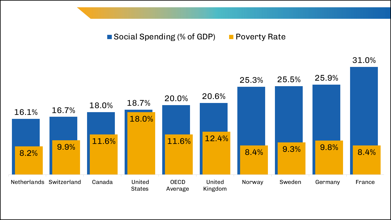
The figure shows public social spending as a percentage of GDP, and poverty rate by OECD country. It shows that the United States has the highest poverty rate compared to all other countries in the figure. The United State is the only country that has an almost equal poverty rate to their social spending as a percentage of GDP. The United States has a lower social spending rate than the OECD average. The United States and the United Kingdom are the only two countries that have a higher poverty rate compared to the OECD average. The Netherlands has the lowest social spending percentage of GDP, while France has the highest social spending percentage of GDP.
Values
| Netherlands | Switzerland | Canada | United States | OECD Average | United Kingdom | Norway | Sweden | Germany | France | |
|---|---|---|---|---|---|---|---|---|---|---|
| Social Spending (% of GDP) | 16.1% | 16.7% | 18.0% | 18.7% | 20.0% | 20.6% | 25.3% | 25.5% | 25.9% | 31.0% |
| Poverty Rate | 8.2% | 9.9% | 11.6% | 18.0% | 11.6% | 12.4% | 8.4% | 9.3% | 9.8% | 8.4% |
Presentation
The bar graph shows poverty rate overlaying social spending as a percentage of GDP for nine countries and the OECD average. Social spending as a percentage of GDP is represented horizontally by dark blue columns with corresponding percentage number at the top of each column. Poverty rate by country is represented horizontally by gold columns overlaying the blue columns representing social spending as a percentage of GDP with corresponding percentage number at the inside top of each column. There is a bar for each OECD country including the OECD Average which is represented horizontally from left to right, in order from lowest to highest social spending as a percentage of GDP: Netherlands, Switzerland, Canada, United States, OECD Average, United Kingdom, Norway, Sweden, Germany, and France.