Figure 1
Overview
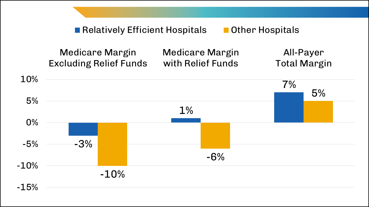
The figure shows hospital performance between relatively efficient hospitals and other hospitals by median Medicare operating margin in 2020. It shows that excluding COVID-19 relief funding, relatively efficient hospitals have a smaller Medicare operating margin than other hospitals, though both still have negative margins. Including COVID-19 relief funds, relatively efficient hospitals have a positive Medicare operating margin, while other hospitals continued to have a negative Medicare operating margin. Both relatively efficient hospitals and other hospitals have a positive all-payer total margin.
Values
| Medicare Margin Excluding Relief Funds | Medicare Margin with Relief Funds | All-Payer Total Margin | |
|---|---|---|---|
| Relatively Efficient Hospitals | -3% | 1% | 7% |
| Other Hospitals | -10% | -6% | 5% |
Presentation
The bar chart represents Medicare margins by category, hospital type, and margin percentage range. Medicare margins are represented by category horizontally from left to right as Medicare Margin Excluding Relief Funds, Medicare Margin with Relief Funds, and All Payer Total Margin. The percentage range of margins is represented vertically from -15% to 10%. Hospital type is represented using horizontally placed columns designated by color: Relatively Efficient Hospitals (gold), and Other Hospitals (blue).
Figure 2
Overview
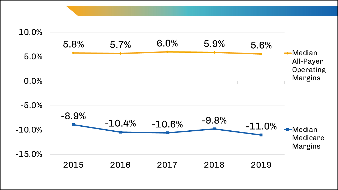
The figure shows Medicare and All-payer Operating Margins for U.S. hospitals from 2015-2019. It shows that Median Medicare Margins remain consistently negative across years, with the lowest margin in 2019; while median All-payer Operating Margins remain positive from 2015 to 2019.
Values
| Year | 2015 | 2016 | 2017 | 2018 | 2019 |
|---|---|---|---|---|---|
| Median All-Payer Operating Margins | 5.8% | 5.7% | 6.0% | 5.9% | 5.6% |
| Median Medicare Margins | -8.9% | -10.4% | -10.6% | -9.8% | -11.0% |
Presentation
The line chart represents years, Medicare and All-payer Operating Margins, and margin percentage range. Years are represented horizontally from 2015-2019. Medicare and All-payer Operating Margins are represented by line designated color: Median Medicare Margins (blue), Median All-Payer Operating Margins (gold). The operating margin is represented vertically from -15% to 10%.
Figure 3
Overview
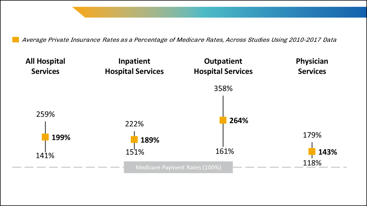
The figure shows average private insurance payment rates relative to Medicare payment rates for hospital and physician services. It shows that across all services, private insurance rates are higher than Medicare payment rates. Private percentage rates for All Hospital Services and Inpatient Hospital Services are similar in both average rate and range, while Outpatient Hospital Services rates are higher in average rate and range, and Physician services rates are lower in average rate and range.
Values
| Average Percentage Range | All Hospital Services | Inpatient Hospital Services | Outpatient Hospital Services | Physician Services |
|---|---|---|---|---|
| Q1 | 259% | 222% | 358% | 179% |
| Mean | 199% | 189% | 264% | 143% |
| Q3 | 141% | 151% | 161% | 118% |
Presentation
This box plot represents hospital and physician services, average private insurance rates by service, and ranges for average private insurance rates. Hospital and physician services are represented horizontally by category from left to right: All Hospital Services, Inpatient Hospital Services, Outpatient Hospital Services, and Physician Services. Private insurance payment rates are represented by gold boxes lined up horizontally for each service. Ranges for private insurance rates are represented by vertical lines intersecting a gold box representing the averages.